PROJECT OVERVIEW:
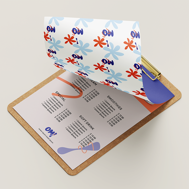
"OM! Ice Cream" is a conceptual project that seeks to redefine the premium ice cream experience with a delightful and playful vibe. Inspired by the cheerful exclamation 'OMG' and the irresistible allure of 'O my yummy', this creative venture unfolds as a vibrant visual story.
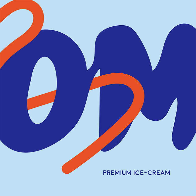
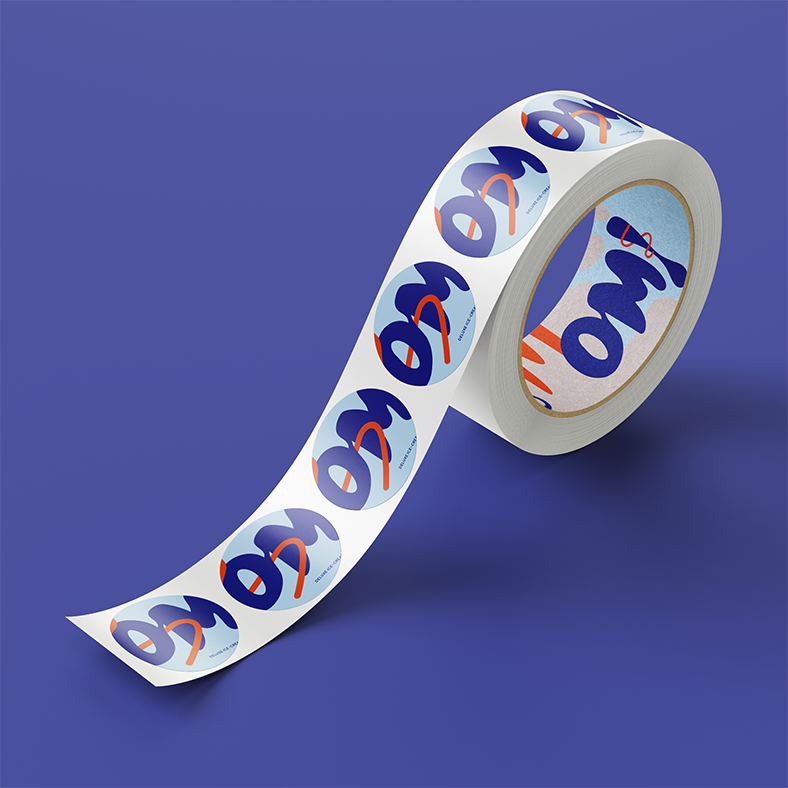
The brand's centerpiece is a dynamic logo, featuring a whimsical melting effect reminiscent of a playful spoon and the swirling dance of melting chocolate. Infused with lively hues of bright blue and orange, every scoop promises a burst of energy, inviting the younger audience to indulge in a premium ice cream celebration.
CHALLENGES:
The challenge lies in infusing a sense of playfulness into the brand without compromising its premium positioning. Striking the right balance between sophistication and a lighthearted, festive vibe is essential to create a brand that not only appeals to the target youngsters but also communicates the indulgent nature of the ice cream.
Approaches:
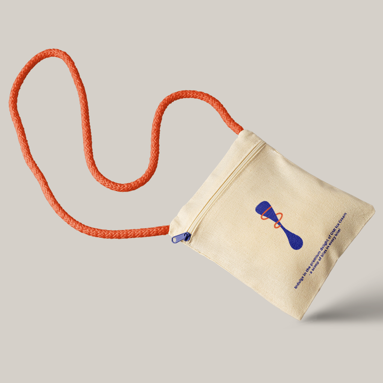
The approach embraces a bright and cheerful visual identity that stands out by an energetic colour scheme, quirky graphics, and modern typography. The brand's visuals will show youngsters enjoying the premium ice cream in a carefree, joyful setting, capturing real feelings of happiness and celebration. I hope to elevate the enjoyment of high-quality ice cream while simultaneously projecting an enticingly playful and lively image, establishing "OM! Ice Cream" as the go-to option for everyone looking for a fun and lively dessert.


